Ecommerce
 Hafiz Muzzammil · February 2, 2025 · 10 min read
Building an Online Store That Actually Sells
Hafiz Muzzammil · February 2, 2025 · 10 min read
Hafiz Muzzammil · February 2, 2025 · 10 min read

Setting up an online store has never been easier. Platforms like Shopify and WooCommerce allow anyone to launch an ecommerce site in an afternoon. However, there is a massive difference between a website that can process payments and an online store engineered to generate revenue reliably.
At Calvex Studio, we frequently audit ecommerce stores that have great products and significant traffic but suffer from abysmal conversion rates. Time and again, we find the same fundamental UX and strategy errors costing these businesses thousands of dollars. Here is our blueprint for building an ecommerce experience that actually sells.
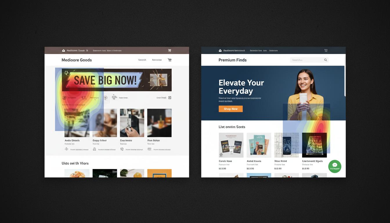
When a visitor lands on your homepage, they should immediately understand three things without scrolling: what you sell, why it's better than the alternatives, and how to start shopping.
Avoid vague, "clever" headlines. If you sell sustainable leather bags, your headline shouldn't be "Journey Into Tomorrow." It should be "Sustainable Leather Bags Crafted for the Modern Commuter." Pair this clear value proposition with high-quality lifestyle imagery and a prominent "Shop the Collection" call-to-action (CTA).
Users who utilize the search function on an ecommerce site convert at up to 3x the rate of those who just browse. Yet, most default search bars are terribly unoptimized.
Your product page (PDP) is where the actual decision is made. A high-converting PDP anticipates objections and provides all necessary information in an easily digestible format.
"The best product pages don't just sell the features; they sell the outcome. They answer the user's implicit question: 'How will this make my life better?'"
Visuals do the heavy lifting: Include at least 4-5 high-resolution images showing the product from different angles, in context (lifestyle shots), and ideally a short video demonstrating its use.
Clear Hierarchy: The price, title, and "Add to Cart" button should be immediately visible above the fold on both desktop and mobile.
Anticipate Objections: Include shipping costs, return policies, and warranty information right next to the buy button. Don't make users hunt for this in the footer.
If a customer has never heard of your brand, their default state is skepticism. You must proactively build trust.
Nearly 70% of shopping carts are abandoned. While some of this is natural window-shopping, a complicated checkout process is a leading culprit. Your goal is to remove every possible point of friction between the cart and the confirmation page.
Always offer a guest checkout option. Forcing users to create an account is the fastest way to lose a sale. Provide accelerated payment methods like Apple Pay, Google Pay, and Shop Pay. Ensure that error messages are clear and helpful (e.g., "Please enter a valid zip code" instead of "Form Error").
The customer journey doesn't end when the credit card is charged. The post-purchase experience dictates whether they will ever buy from you again.
Your order confirmation page should explicitly state what happens next. Send branded, informative email updates for order confirmation, shipping, and delivery. A few days after delivery, trigger an automated email sequence asking for a review or offering a discount on their next purchase.
A successful ecommerce store is an exercise in empathy. It's about understanding the customer's desires, anticipating their hesitations, and removing any technical barriers in their path. By implementing these foundational strategies, you transform your website from a digital catalog into an active sales engine.
Is your ecommerce conversion rate lower than industry averages? Reach out to Calvex Studio for a comprehensive store audit and optimization strategy.